After first Keynote on Directions NA, we got a very exciting news about rebranding of our products and about their common future as Dynamics 365 ‘Tenerife’. In my previous post, I wanted to announce only the most important news and later write a more detailed. But in a meantime, Waldo wrote a post with perfect explained all these details and I’ll just give you URL to this post instead of writing the same text.
Before I start with other exciting news from the second Keynote part, first I want to share details when we can expect new products:
- Dynamics 365 ‘Tenerife’ – In preview, but GA Spring 2018
- Dynamics 365 for Sales – In preview, but GA Spring 2018
- Dynamics 365 for Marketing – In preview
Dynamics GP and Dynamics SL will continue as for now with the same name and we will get new versions this year at Q4.
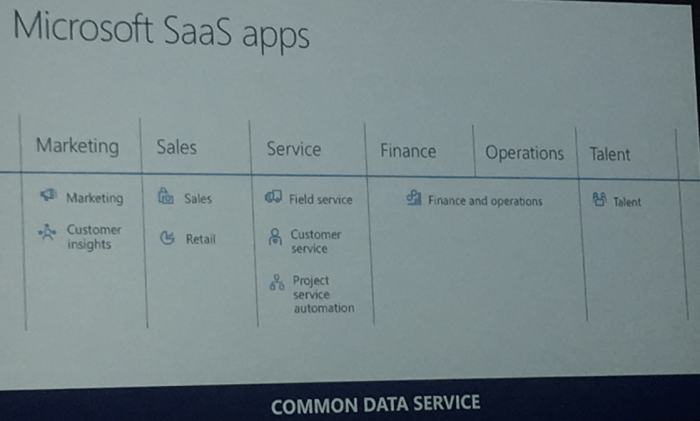
But now, what we have more about new future release. OK we will get a lot of new features, but on the first sight, new UX will be the first what we can see and just to say my personal opinion – It is the great work. We will get complete rendered web client (probably Tablet and Phone and the same time, I’m not sure). Now when you compare all Dynamics 365 clients, there are all almost the same. This is the point, we don’t want to speak about specific different solutions, we want to speak only about Dynamics 365 as a product; and of course, we will run only these Apps we need:
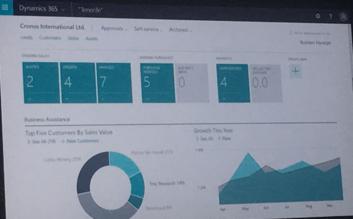
Now, I can just share some first pictures of the new client to see how it looks like. When we run Dynamics 365 ‘Tenerife’, we can see new refreshed role center with very interesting ordered information:

Then in further, when we slightly go down, we can see more tiles and Power BI charts:
If we click on some tile, we can get very first sight to the most important information in beautiful interface:

The list pages are very similar as in old client, but without fact boxes. These information will be available on a different place, but by my opinion on much better place:

And on the end, cards are little bit different with the most important information on the top of card:

I really like this new interface and I cannot wait to make more tests with this.

This looks nice and fresh UX. When we (partners) will be able to test NAV (Dynamics 365 “Tenerife”)?
LikeLike
I still don’t know
LikeLike
[…] After first Keynote on Directions NA, we got a very exciting news about rebranding of our products and about their common future as Dynamics 365 ‘Tenerife’. In my previous post, I wanted to announce only the most important news and later write a more detailed. But in a meantime, Waldo wrote a post with perfect explained all these details and I’ll just give you URL to this post instead of writing the same text. More… […]
LikeLike
[…] New product will have new modern user interface, almost the same as other D365 products and this will be very important for future customers, because they will have the same filling working in different Apps. […]
LikeLike