Run D365 Business Central for the first time

When you run your Dynamics 365 Business Central for the first time, you will see new refreshed Web Client. Well, I think we will get some more small features soon (but just small polishing). Anyway, everything is easy for navigate and everything is exactly where you expect to be. And everything works very smoothly. I think the first what we can see are the messages in the left part of screen, with the most important information (the first will be “Good afternoon…”, but after that information).

d365bc1.PNG

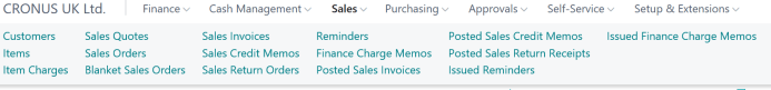
Now we have a main menu on the top of the screen. Depends what we choose, we will get submenu just below the first row. Again, depends of the number of commands, we will get just one or more rows.

d365bc2

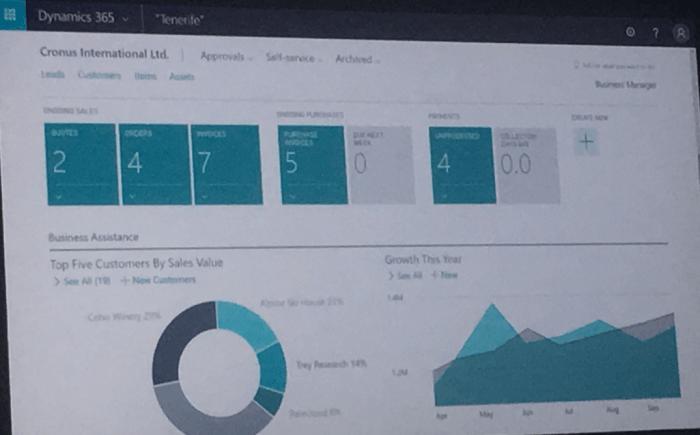
But we also have a lot of the most important actions on the right side of the page. Then we can see information and tiles in the activities and there are ordered noticeable. If you click on ‘See more’ or on some tile, you will open additional information (the same thing s with the large message on the left top part of screen).

We can also find “Product videos” and “Get started” links. On “Product videos”, you can find a few interesting videos about product, but more interesting is “Get started”. OK, we can find some educated videos again, but we have something more interesting – Role Centers link. With this, we can Explore different business roles features.

d365bc3.PNG

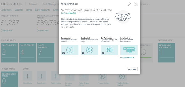
If you run it, you will get new window where you can choose all available role centers as an option and see what features are covered with each of them as the main menu structure (for each of them, you will see small tooltips with the basic information). And even more, if you click on Continue, you can change your role center; and again you don’t need to make logout/login, because system will change your role center automatically.

d365bc4.PNG

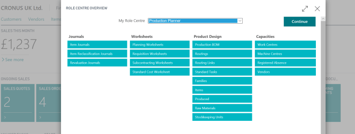
Of course, you can change your role center using ‘My Settings’, but guess… you will run the same page as I already showed. Really good user experience.

Then, when you run some page, from menu… for example customer, you can choose if you want to unpin the top menu… just to get little more space. Of course, you can chose the view type and so. But everything is so modern and provides really good experience.

d365bc5

OK, this is just beginning. This is still not even the first impression. But I don’t like to write so big texts. I’ll continue soon with more details.

Advertisement

New UX in NAV (Dynamics 365 Tenerife)

After first Keynote on Directions NA, we got a very exciting news about rebranding of our products and about their common future as Dynamics 365 ‘Tenerife’. In my previous post, I wanted to announce only the most important news and later write a more detailed. But in a meantime, Waldo wrote a post with perfect explained all these details and I’ll just give you URL to this post instead of writing the same text.

Before I start with other exciting news from the second Keynote part, first I want to share details when we can expect new products:

  • Dynamics 365 ‘Tenerife’ – In preview, but GA Spring 2018
  • Dynamics 365 for Sales – In preview, but GA Spring 2018
  • Dynamics 365 for Marketing – In preview

Dynamics GP and Dynamics SL will continue as for now with the same name and we will get new versions this year at Q4.

But now, what we have more about new future release. OK we will get a lot of new features, but on the first sight, new UX will be the first what we can see and just to say my personal opinion – It is the great work. We will get complete rendered web client (probably Tablet and Phone and the same time, I’m not sure). Now when you compare all Dynamics 365 clients, there are all almost the same. This is the point, we don’t want to speak about specific different solutions, we want to speak only about Dynamics 365 as a product; and of course, we will run only these Apps we need:

##1.PNG

Now, I can just share some first pictures of the new client to see how it looks like. When we run Dynamics 365 ‘Tenerife’, we can see new refreshed role center with very interesting ordered information:

##2.PNG

Then in further, when we slightly go down, we can see more tiles and Power BI charts:

##3.PNG

If we click on some tile, we can get very first sight to the most important information in beautiful interface:

##4.PNG

The list pages are very similar as in old client, but without fact boxes. These information will be available on a different place, but by my opinion on much better place:

##5.PNG

And on the end, cards are little bit different with the most important information on the top of card:

##6.PNG

I really like this new interface and I cannot wait to make more tests with this.

New NAV Roadmap (NAV2016)

Microsoft has officially published new Microsoft Dynamics NAV roadmap. You can download it form PartnerSource using the following link: //aka.ms/navroadmap

Before NAV 2016, roadmap was as following:NAVRM15

Now, Microsoft adds new version and what we can expect in the future:

NAVRM16

If you want to see everything news in NAV 2016, you can use the following picture:

NAV16OW

There are only basics on previous picture. The completely news are really excited and I cannot wait to tell you more about them, but we still need to wait some time.